Snapdeck Sans — A Typeface for Slides and Product UI
After building font.snapdeck.app, we spent a lot of time comparing thousands of open fonts. There were many good options, but it was hard to find one family that matched how Snapdeck actually uses type.
Slide titles need to stay readable from a distance. Slide body text needs to hold dense information without feeling cramped. Product UI labels need to stay clear at small sizes, especially on dark backgrounds. PDF export needs to preserve the same layout users saw on screen. That is why we built Snapdeck Sans: a Hangul + Latin sans for Snapdeck product UI, AI-generated slides, and PDF export.
Why we made our own
Fonts were not just an aesthetic decision for Snapdeck. Each deck raised the same questions: Which font works for the title? Does the body pair well with Inter? Can we use this commercially? Will the line breaks change when we export to PDF?
Pretendard, Inter, SUIT, Asta Sans, and Goorm Sans were all strong candidates. The issue was that Snapdeck needed one type family to move across several contexts.
| Use | What we needed | Common issue with existing combinations |
|---|---|---|
| Slide titles | Weight and presence that read from a distance | UI fonts felt weak in titles; display fonts felt heavy in product UI |
| Slide body | High information density and stable readability | Korean and Latin pairings often disagreed in line height and x-height |
| Snapdeck UI | Clear labels and buttons on dark backgrounds | Slide-friendly fonts blurred in small UI text |
| PDF export | Layout parity between screen and PDF | Mixed web and local fonts could shift line breaks and box heights |
The conclusion was simple: instead of recombining separate title, body, and UI fonts for every project, Snapdeck needed one family where weight changes do most of the work.
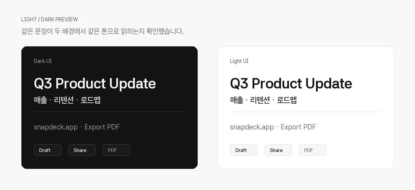
We also kept one of the core checks from the font.snapdeck.app MVP: preview the same text on both light and dark backgrounds. Many fonts look great on a landing page, then lose clarity inside a dark product interface.
What is Snapdeck Sans
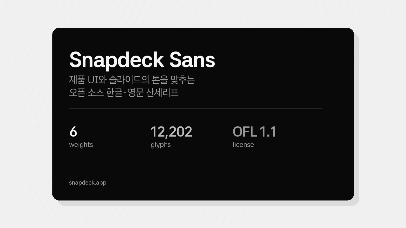
Snapdeck Sans is an open-source sans by askitmore (Snapdeck Sans Project Authors). We made it for Snapdeck first, but under the OFL terms it can be used for personal work, commercial projects, products, brands, apps, websites, documents, presentations, and AI-generated output.
- License: SIL Open Font License 1.1 (OFL)
- Reserved Font Name: none
- Format: 6 OTF files
- Version: 1.000
- References / base: Asta Sans (42dot), Pretendard, Goorm Sans, Satoshi
There is no Reserved Font Name, so modification, redistribution, and embedding are allowed within the OFL. We did not want this to be a closed internal font. We wanted it to be something people could actually use.
One Family For Slides And UI
Snapdeck Sans is not meant to be a loud display face. Its job is to be a stable default across slides, dashboards, buttons, and PDFs.
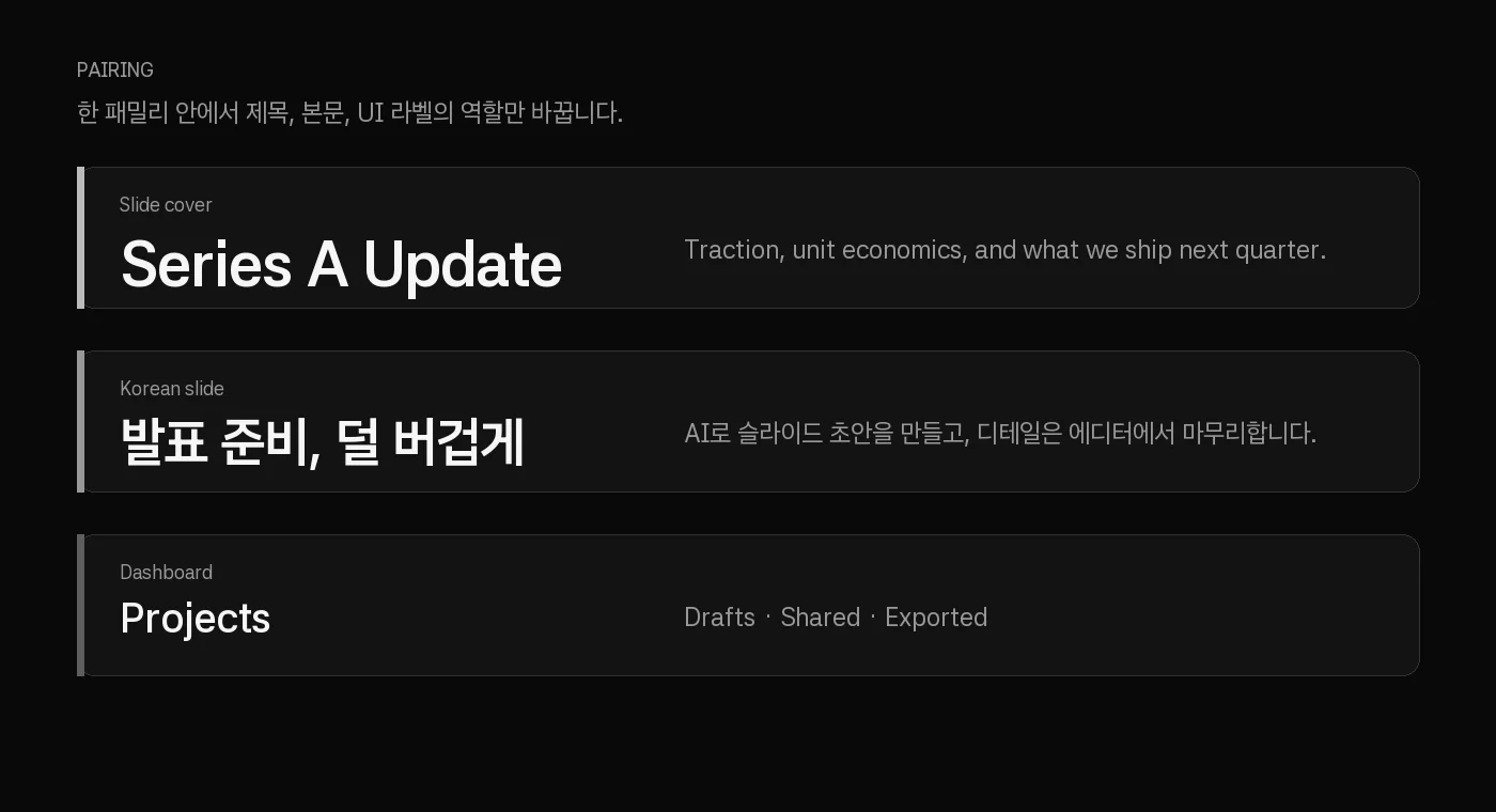
| Context | Headline | Body | Recommended weight |
|---|---|---|---|
| Slide cover | Series A Update | - | Bold 700 |
| Slide body | - | Traction, unit economics... | Regular 400 |
| Section head | Q3 Product Update | Revenue · retention · roadmap | Bold 700 + Regular 400 |
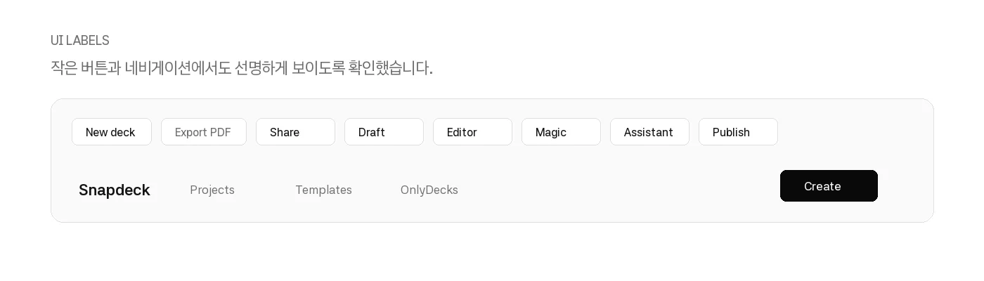
| UI navigation | Projects | - | SemiBold 600 |
| Buttons / labels | Export PDF | - | Medium 500 |
| Captions | - | snapdeck.app · Draft | Light 300 |
On font.snapdeck.app, we kept comparing combinations like "Pretendard + Inter?" or "Goorm Sans + Satoshi?" because Korean and Latin text need to sit naturally on the same screen. Snapdeck Sans shortens that decision. Use one family for title, body, and UI labels, then adjust the weight.
Structure - 6 weights, 12,202 glyphs
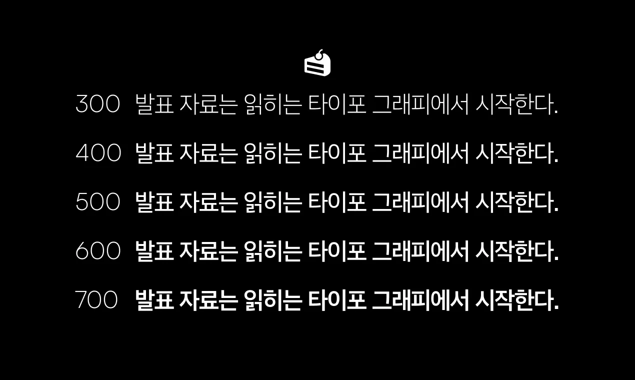
Snapdeck Sans includes six weights from Light to ExtraBold.
| Weight | CSS font-weight |
File |
|---|---|---|
| Light | 300 | SnapdeckSans-Light.otf |
| Regular | 400 | SnapdeckSans-Regular.otf |
| Medium | 500 | SnapdeckSans-Medium.otf |
| SemiBold | 600 | SnapdeckSans-SemiBold.otf |
| Bold | 700 | SnapdeckSans-Bold.otf |
| ExtraBold | 800 | SnapdeckSans-ExtraBold.otf |
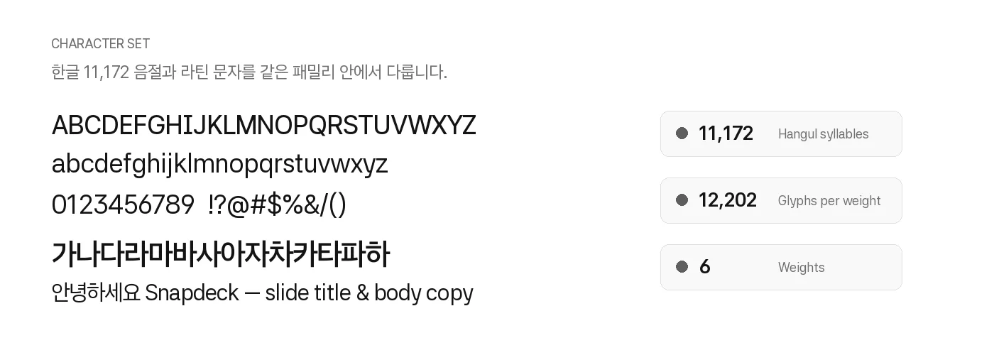
Each weight contains 12,202 glyphs and 12,180 cmap codepoints. Coverage stays identical across the family, which reduces the chance of fallback glyphs appearing only at certain weights.
- Hangul syllables: 11,172 (full U+AC00-U+D7A3)
- Hangul jamo: 94
- Latin: basic 52 + extended Latin
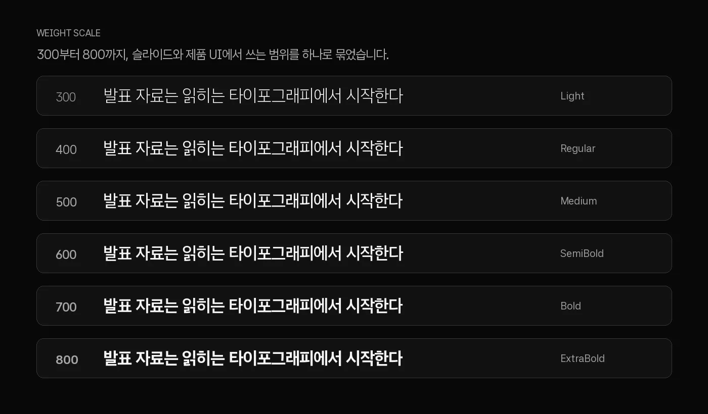
The weight range is 300-800, chosen for slides and UI together. Regular and Medium work for body text and UI labels. SemiBold and Bold work for navigation and titles. ExtraBold gives covers and section dividers stronger contrast. Light is useful for captions and long secondary text.
Form - Neutral Geometric Sans
Snapdeck Sans is close to a neutral geometric sans. It builds on Asta Sans and is tuned for the situations we see most often in Snapdeck slides and product UI.
Proportions
| Metric | Value (unitsPerEm = 1000) |
|---|---|
| Ascender | 990 |
| Descender | -251 |
| x-height | 505 |
| cap-height | 707 |
| x-height / cap-height | 0.714 |
| Italic angle | 0° (upright only) |
The x-height is about 71% of the cap height. Body text stays readable at smaller sizes, while uppercase letters still feel clear in titles and UI labels.
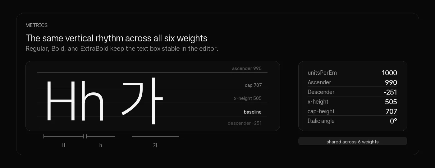
The vertical metrics are also important. All six weights share identical vertical metrics. Switching Regular to Bold does not change line height or text box height. In the Snapdeck editor, where users often change only the weight of a text layer, that stability matters.
Latin letterforms
- H, n, o: simple geometric forms that stay clear in titles
- a: single-storey style with two contours
- g: loop + tail structure for body rhythm
- S, R: balanced curves that do not draw too much attention in UI or slides
As weights get heavier, stems become thicker and advance widths become slightly wider. For example, the H advance width changes like this:
| Weight | advance width |
|---|---|
| Light 300 | 656 |
| Regular 400 | 668 |
| Bold 700 | 688 |
| ExtraBold 800 | 694 |
Bold is about 5% wider than Regular. That can change line breaks in slide titles, so it is worth previewing real sentences, just like we do on font.snapdeck.app.
Hangul
Hangul is covered with 11,172 complete syllable glyphs. It does not rely only on jamo composition, which helps preserve the same shapes in PDF export, offline rendering, and the editor canvas without depending on webfont fallback.
Most Hangul syllables have an advance width of 813. It is not a strict monospace design, but the near-fixed grid keeps bullets, tables, and short labels visually aligned.
OpenType - Features For Slides And UI
Snapdeck Sans OTF includes GSUB and GPOS tables.
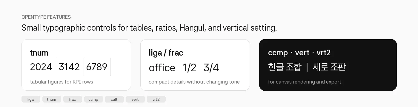
| Feature | Use |
|---|---|
liga |
Ligatures |
tnum |
Tabular figures for tables and KPI columns |
frac |
Fractions |
ccmp |
Hangul jamo composition |
calt |
Contextual alternates |
vert / vrt2 |
Vertical typesetting alternates |
Generated Snapdeck slides often include revenue tables, percentages, and quarter numbers. With tnum, numbers keep a consistent width, so tables and KPI cards feel more stable.
From font.snapdeck.app To Snapdeck Sans
Building font.snapdeck.app made one thing clear: finding good fonts matters, but Snapdeck also needed a default family it could keep using across the product.
So font.snapdeck.app remains a tool for choosing fonts, while Snapdeck Sans is the family we use in Snapdeck. Both live in the OFL ecosystem, but they solve different parts of the workflow: one helps with selection; the other reduces decisions after selection.
Download
Six OTF files and OFL.txt are available here:
- SnapdeckSans-Light.otf
- SnapdeckSans-Regular.otf
- SnapdeckSans-Medium.otf
- SnapdeckSans-SemiBold.otf
- SnapdeckSans-Bold.otf
- SnapdeckSans-ExtraBold.otf
- OFL.txt
CSS example:
@import url("https://font.snapdeck.app/fonts/snapdeck-sans/snapdeck-sans.css");

:root {
  font-family: "Snapdeck Sans", system-ui, sans-serif;
}

.slide-title {
  font-weight: 700;
  font-feature-settings: "tnum" 1;
}

.ui-label {
  font-weight: 500;
  font-size: 14px;
}
Next
Snapdeck Sans v1.000 is the first release tuned for Snapdeck product UI, slides, and PDF export. It starts with six upright OTF files. If the need becomes clear, we will continue with italic, a variable font, and webfont subsets.
If matching Hangul and Latin across slides and product UI is slowing you down, Snapdeck Sans is ready to try. If you want to compare it with other candidates, start from font.snapdeck.app.